Project Name
La Isla Manila Restaurant
La Isla Manila Restaurant
Services Provided
- Brand Identity Design
- Landing Page Design
- Stationery Design
- Marketing and Print Design
- Social Media and Digital Design
Location
Barrie, ON
Industry
Hospitality & Cultural Dining
Year Completed
2025
The Challenge
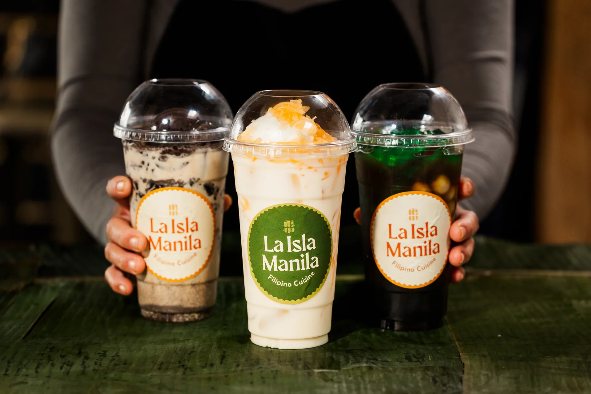
La Isla Manila had a name people recognized and food they came back for. But when new ownership stepped in, something didn't quite fit. The brand they inherited told the wrong story or maybe no story at all. It lacked the warmth you feel the moment the food hits the table. The visuals were inconsistent. The identity was fractured. And for a restaurant with real ambitions, a growing chain rooted in Filipino culture, that gap between what it was and what it could be was getting harder to ignore. This wasn't a touch-up job. It was a complete reimagining.
The Goal
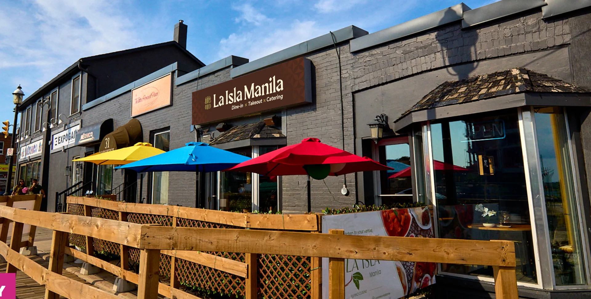
Filipino cuisine carries centuries of history in every dish, shaped by islands, trade routes, family kitchens, and the diaspora. The new La Isla Manila needed to honour all of that while making room for something new: a brand that felt both deeply rooted and unmistakably alive. The goal was to build a visual identity that could speak to the Filipino community searching for a taste of home, and to curious diners sitting down for the very first time. One brand system. One voice. Warm, proud, and built to grow.
The Target Audience
Filipino food lovers and curious diners seeking a vibrant, authentic cultural dining experience.
Core Patrons
For many Filipino-Canadians, a meal at La Isla Manila is more than dinner. It's memory. It's connection. It's a Sunday table recreated in the middle of a Tuesday. This audience isn't just hungry, they're looking for something familiar in a place that isn't always easy to find it.
Culinary Explorers
Then there are the adventurous eaters. The ones who read the whole menu before deciding. Who want to understand what they're eating and why it matters. For them, La Isla Manila is a door, and the brand needed to make that door feel worth walking through.
Competitors Analysis
Most Filipino restaurants in the area were playing it safe, leaning on familiarity without committing to a real point of view. The whitespace was obvious. There was room for a brand that didn't just represent Filipino food, but celebrated it with the confidence it deserves.
The Solution
A bold, heritage-rich brand crafted for La Isla Manila to do more than stand out. Built to tell a story.
Every touchpoint — from the website to marketing assets — was designed to connect deeply, inspire curiosity, and turn first-time visitors into loyal patrons.
Heritage-Driven Identity
The visual identity was built around cultural pride, not cultural decoration. Every colour, every type choice, every detail was chosen to feel like it belonged, not borrowed. Bold enough to turn heads. Considered enough to earn trust.
Website as a Cultural Gateway
The menu landing page wasn't designed to just list dishes. It was designed to make you feel something before you even arrive. Immersive, intuitive, and unmistakably La Isla Manila from the first scroll to the last click.
Marketing & Brand Assets
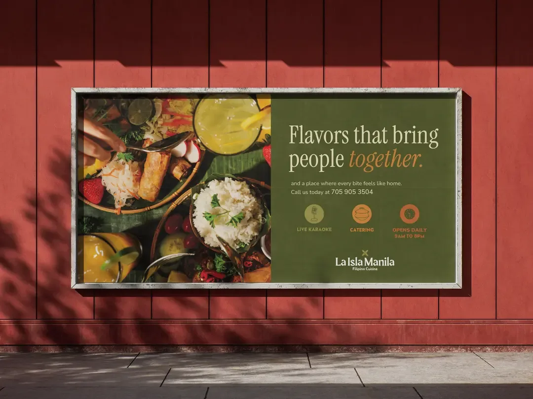
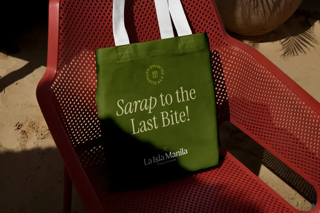
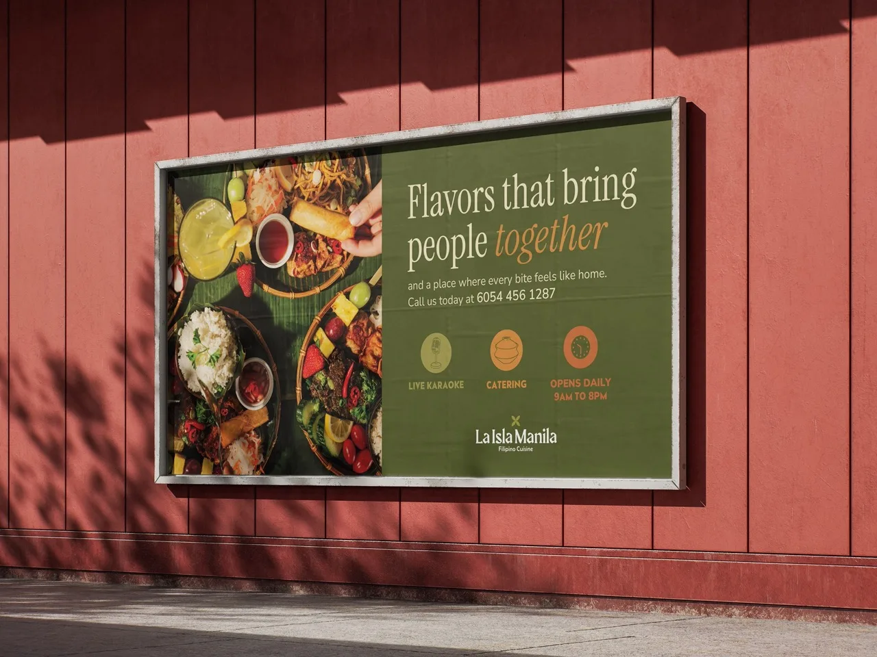
From Uber Eats placements to out-of-home digital screens, the identity had to hold up everywhere. Versatile enough to adapt, consistent enough that you always knew exactly who was talking.

theICON
JASMINE FLOWER
AKA SAMPAGUITA
The logo's heart is the Sampaguita, the national flower of the Philippines. Delicate and resilient. A symbol of purity and pride that Filipinos carry with them no matter where they land. It felt like the only honest place to begin.

theWORDMARK
The lettering draws from the ancient Baybayin script, the writing system of pre-colonial Philippines. That contrast of thick and thin strokes, that subtle handwritten pull is history made visible. Paired with a soft, rounded typeface, the result sits somewhere between heritage and warmth. Like coming home.
theLogo Suite
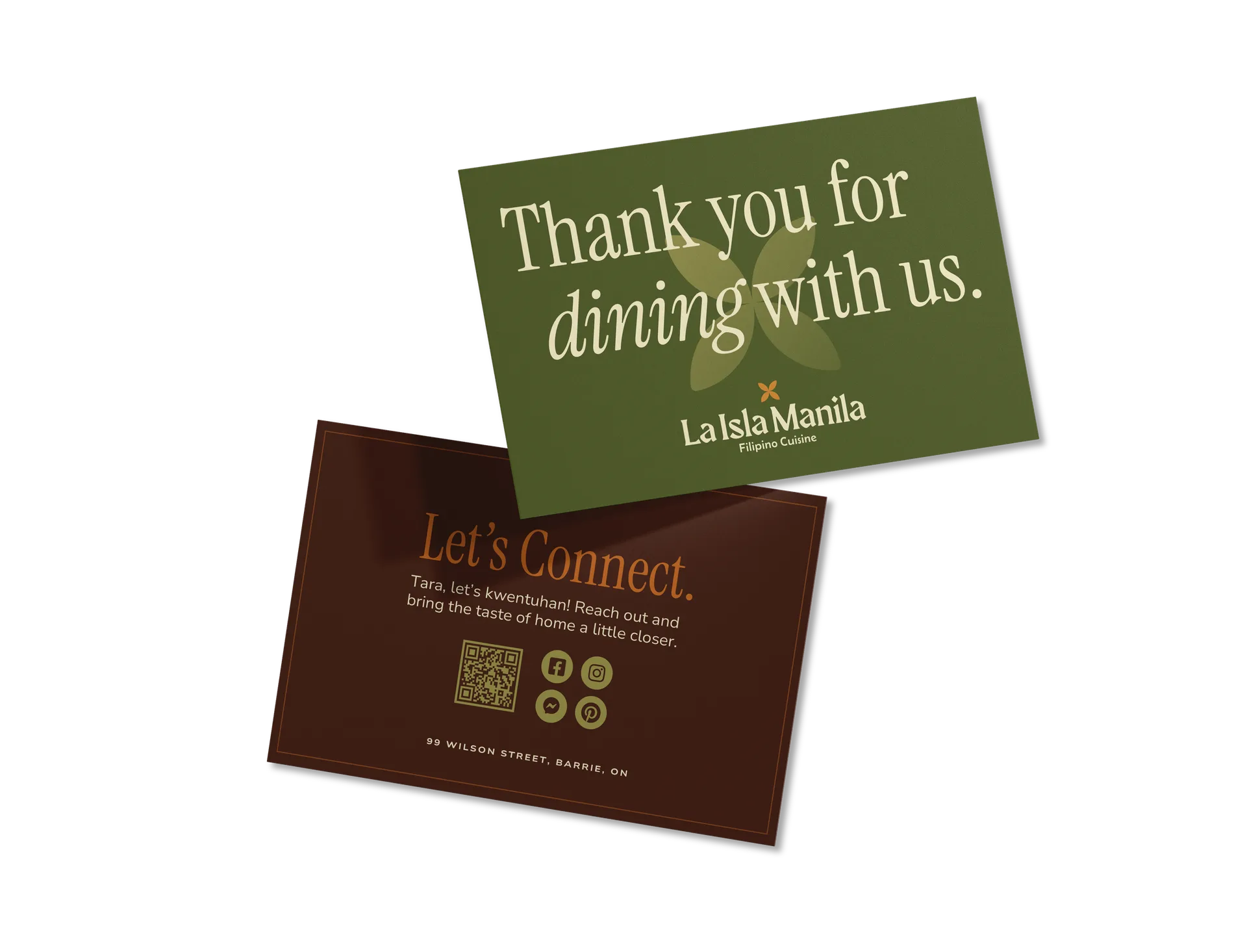
Stationery Design
The business cards were designed to be held, not filed. Bold on the outside. A quiet confidence on the inside. Every printed piece is an extension of the story.
theTYPOGRAPHY & COLOUR PALETTE
Instrument Serif
Nunito Sans
Menu Page Design
The online menu was built to do what a good restaurant should: create anticipation. Bold visuals. Smooth navigation. The kind of experience that makes you want to go before you've even decided what to order.
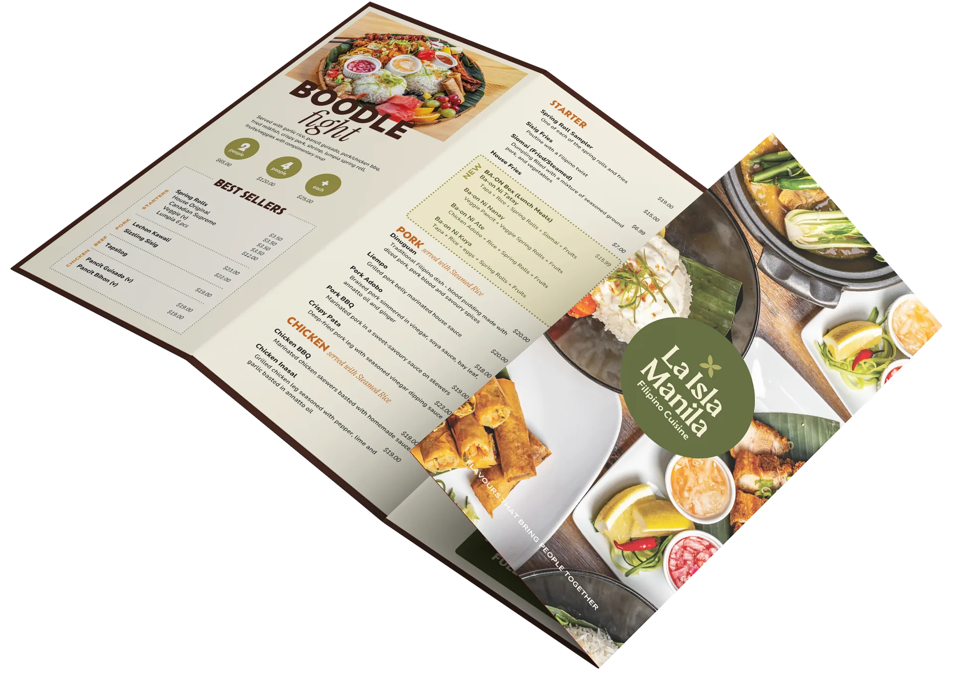
Print Design
From the fold of a flyer to the weight of a menu card, every printed piece was built to feel intentional. Design that doesn't just inform, it lingers.

Digital and Social Media Design
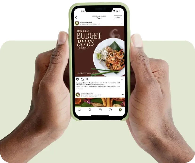
A brand only travels as far as its content. The La Isla Manila social presence was designed to stop the scroll without losing the soul, staying true to the identity whether it was appearing on a billboard or a phone screen at 11pm when someone's craving something real.
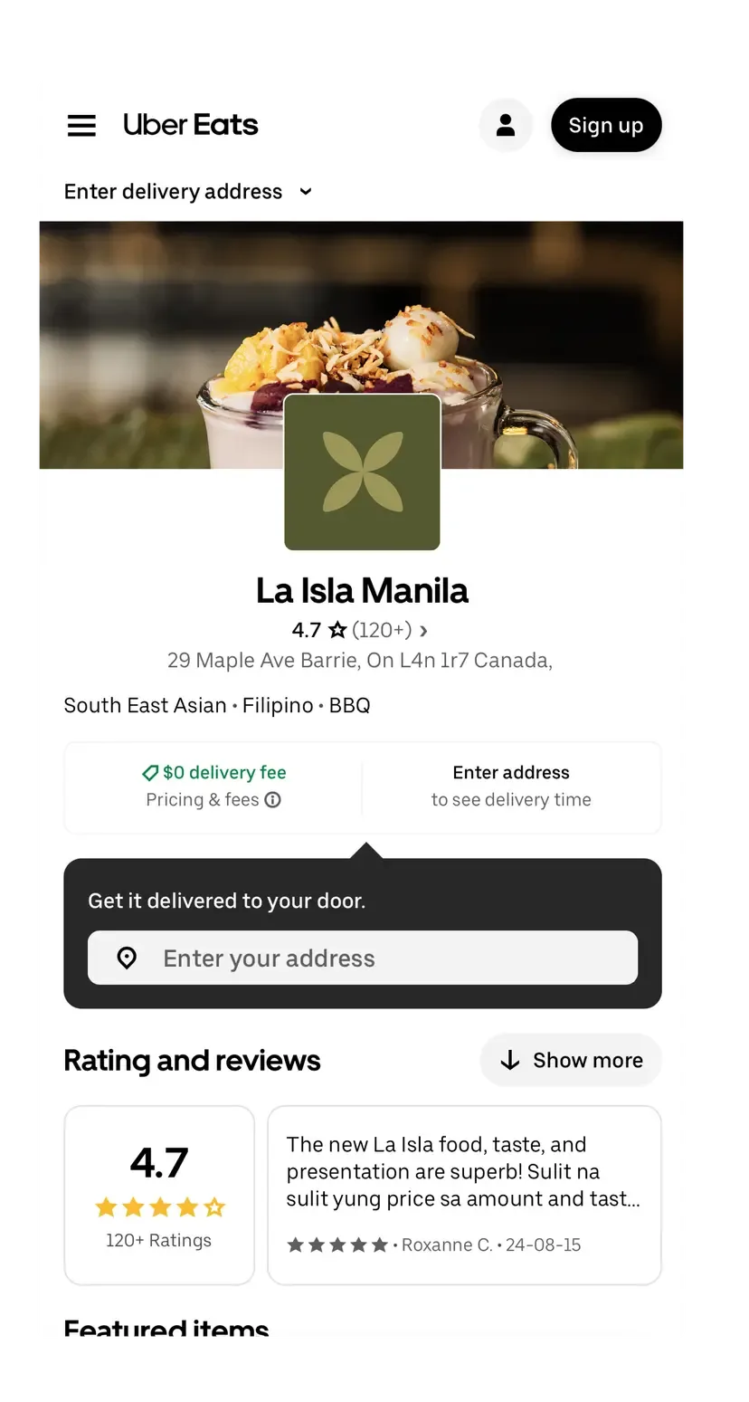
Branded content crafted to carry the La Isla Manila story across social platforms, stopping the scroll while staying true to the identity

“Maryam was a pleasure to work with. I reached out to her to help rebrand our restaurant, and she was incredibly supportive and helpful throughout the entire process. She provided clarity at every stage and was patient when I felt unsure or lacked confidence in making decisions. Her guidance made the process feel manageable, and her turnaround time was impressively quick. The quality of her work was excellent — I highly recommend her!”
Every brand has a story.