Project Name
Cayman Islands Compliance Association
Cayman Islands Compliance Association
Services Provided
- Brand Identity Design
Location
Cayman Islands
Industry
Compliance and Corporate Identity
Year Completed
2023
THE CHALLENGE
Twenty-three years is a long time to build trust. CICA had done exactly that, quietly becoming one of the Caribbean's most respected compliance bodies, one member, one standard, one year at a time. But longevity has a way of leaving its mark on the things that are supposed to represent you. The brand had aged. Not in the way that earns reverence, but in the way that starts to create distance between who you are and how you appear. The financial sector they served was evolving fast.
Their visual identity was standing still. A refresh wouldn't be enough. The identity needed to be rebuilt carefully and deliberately, in a way that honoured everything CICA had earned while making clear they weren't finished yet.

THE GOAL
The brief was deceptively simple: evolve without erasing. Carry 23 years of institutional credibility into a new visual language without making long-standing members feel like strangers in their own organization. The new identity needed to feel anchored in Cayman Islands heritage, authoritative within the compliance world, and polished enough to stand alongside the global financial institutions CICA operates within. Rooted. Modern. Unmistakably theirs.
THE SOLUTION
A compliance brand rebuilt from its roots, carrying 23 years of trust into the next era.
Every visual decision was grounded in meaning, drawing from Cayman Islands heritage and CICA's institutional values to create an identity that commands authority across every touchpoint.
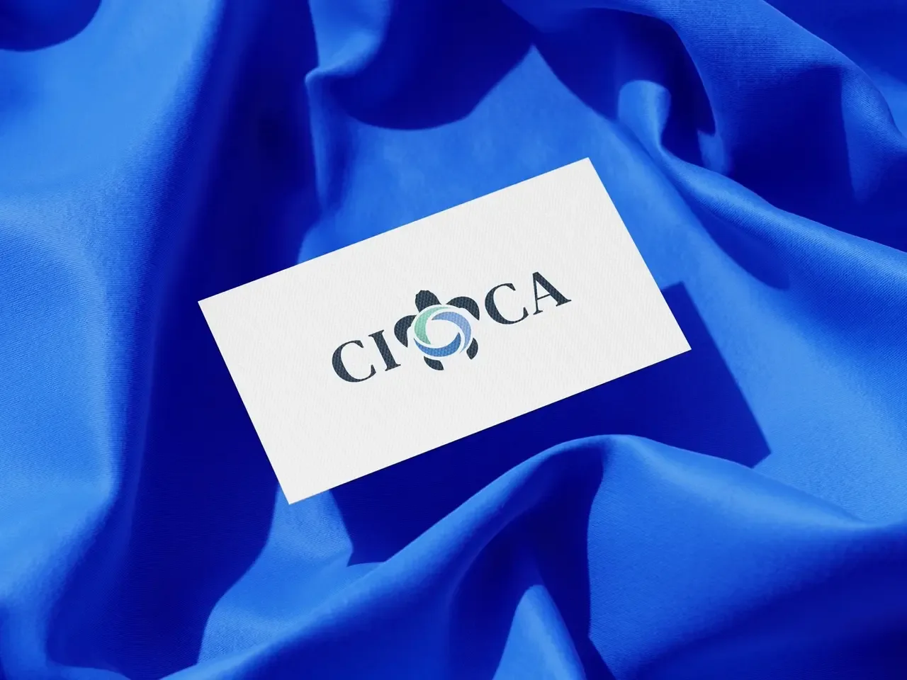
Heritage-Driven Logo Design
The new emblem doesn't just represent CICA, it tells you where they come from. The sea turtle, the Caribbean swirls, the island symbolism- each element was chosen with intention, creating a mark that feels culturally grounded and professionally unshakeable. The kind of logo that holds its authority whether it's on a business card or a billboard.
Modern Visual Identity System
A cohesive design system that finally matched the institution inside it. Bold where it needed to be. Restrained where it mattered. Built to position CICA as a contemporary leader without letting go of the weight that 23 years of trust actually carries.
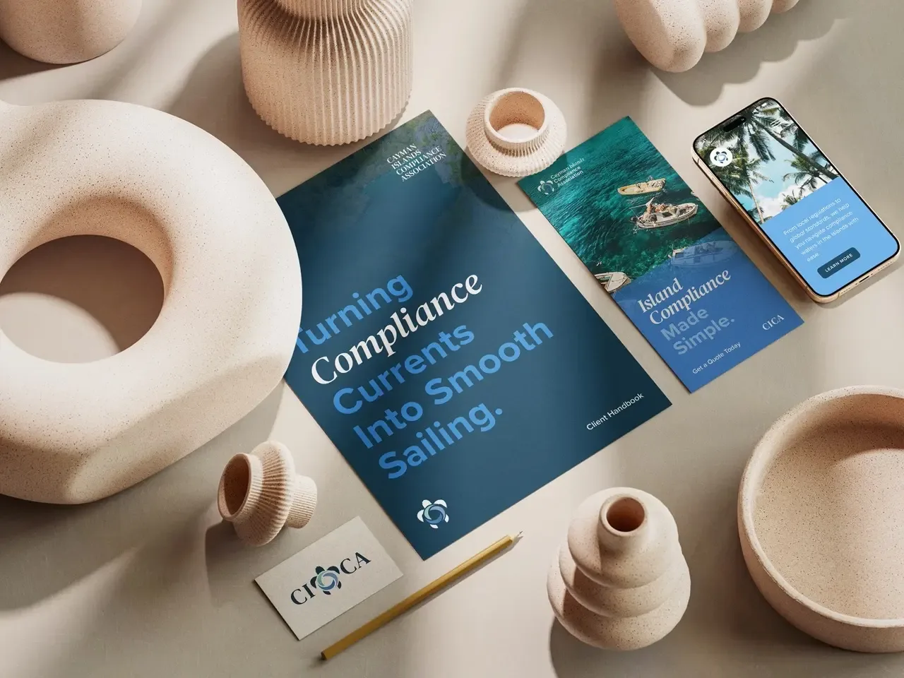
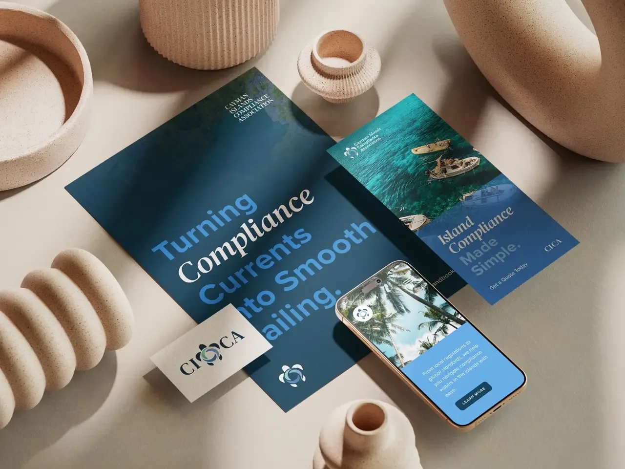
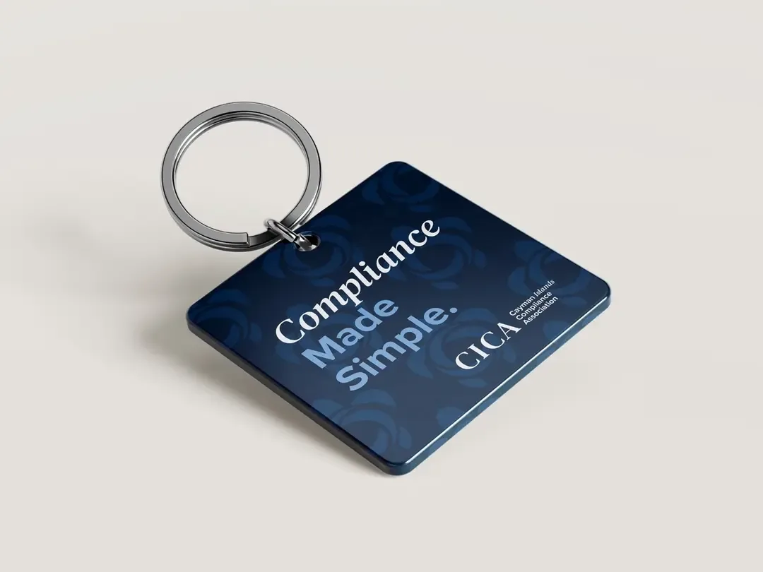
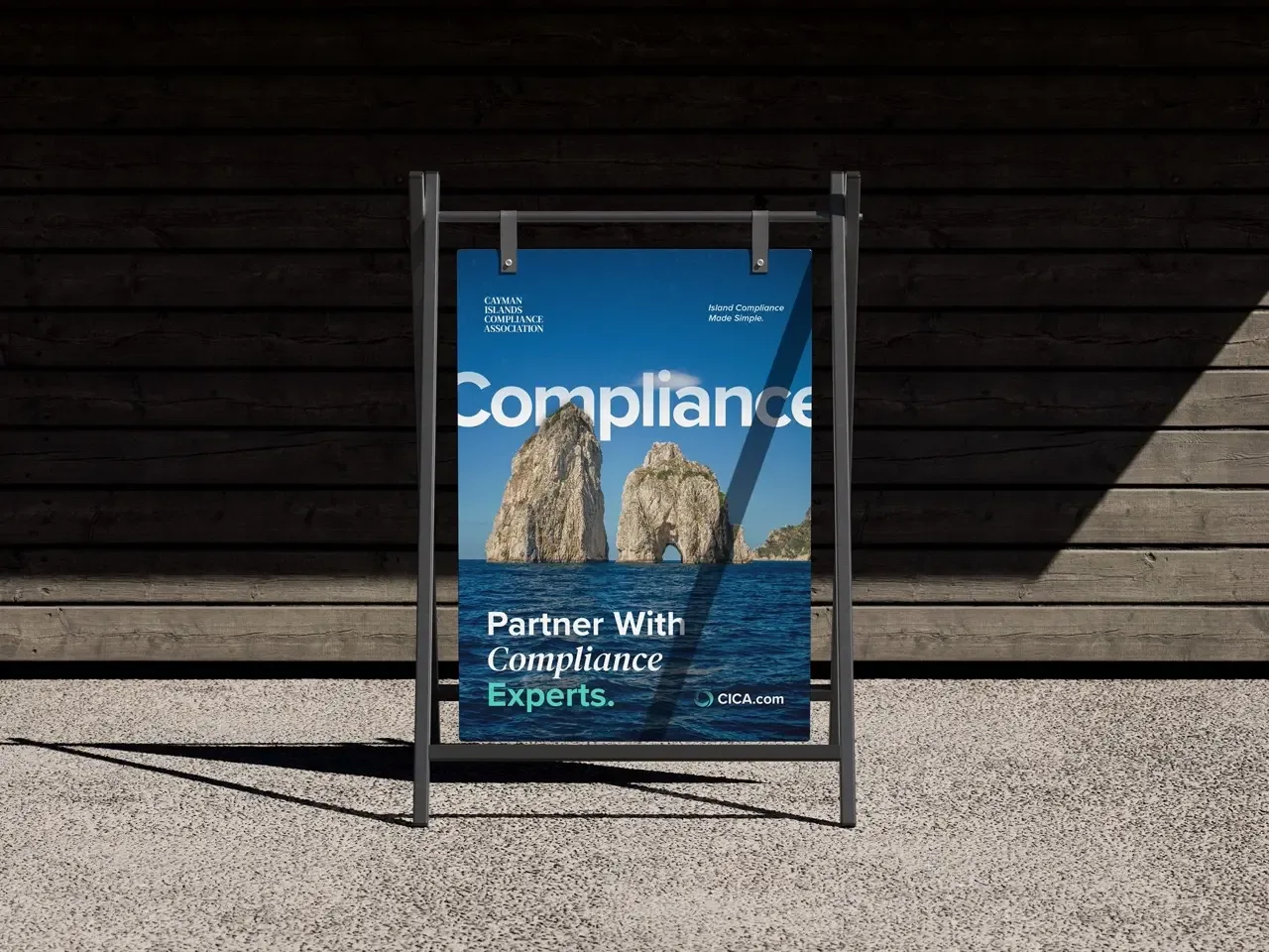
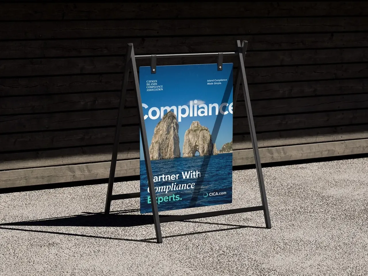
Collateral & Brand Application
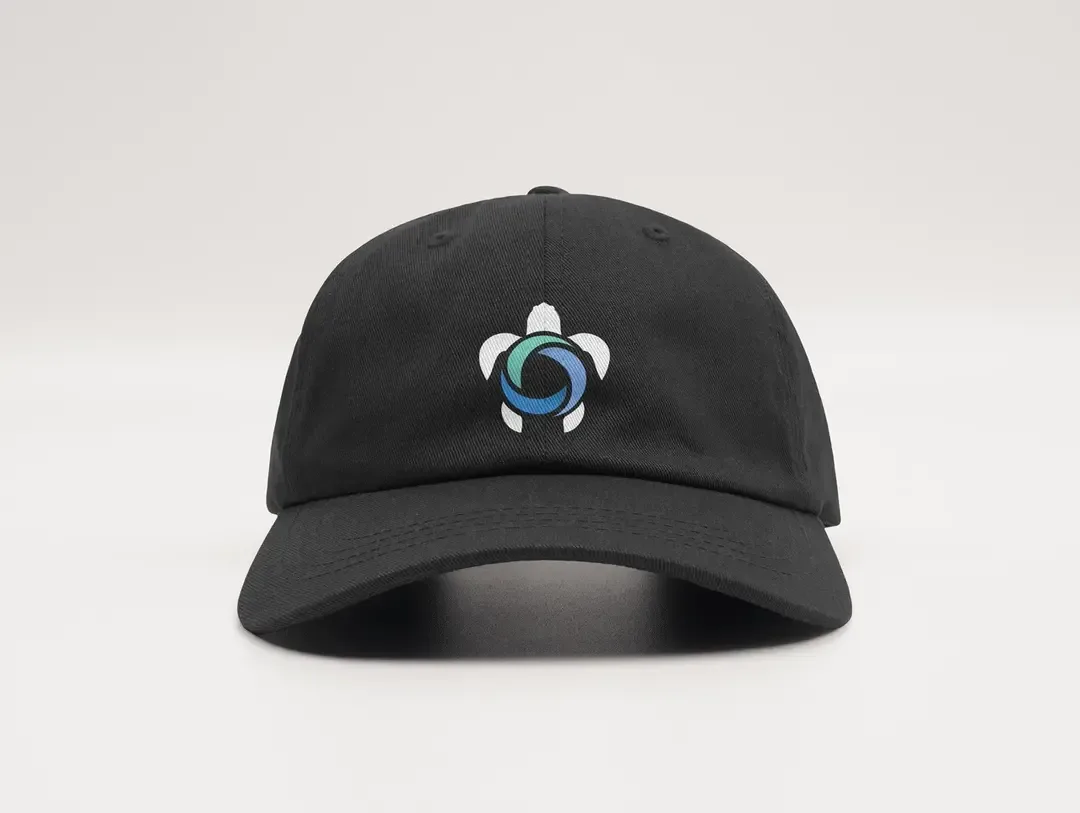
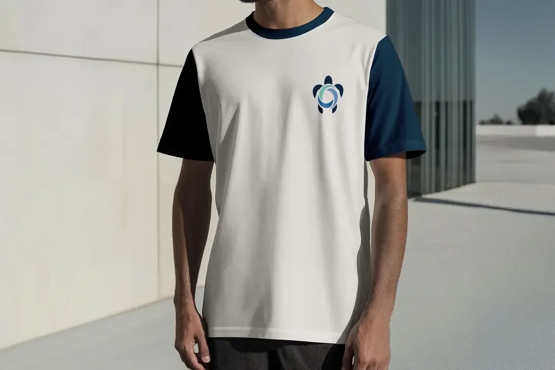
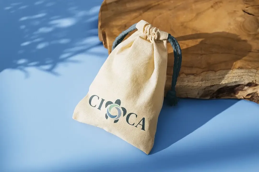
The identity was extended across every surface CICA touches — print, digital, signage, merchandise, stationery. Consistent in every context. Commanding in every room.
LOGO SUITE
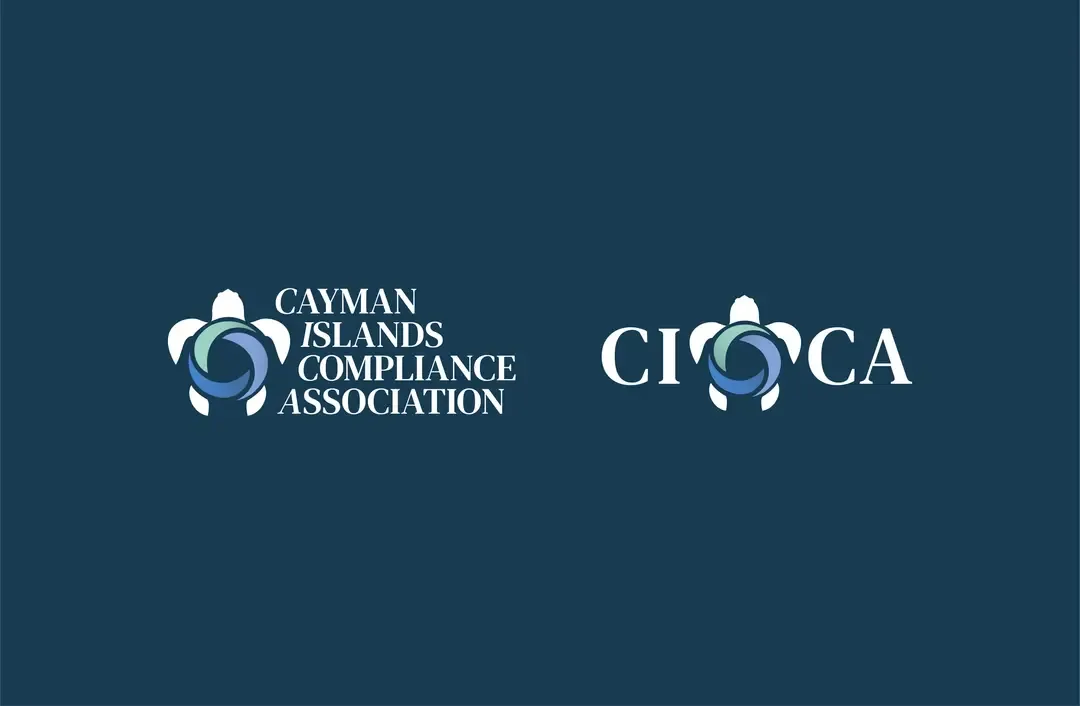
CONTEXT

SEA TURTLE
The presence of the sea turtle in this emblem embodies the profound concepts of longevity and protection. CICA Company has consistently dedicated itself to serving its valued customers over the past 23 years and remains steadfast in preserving their trust and confidence into the future.

SWIRLS
The inclusion of swirls was at the specific request of the client, who aimed to symbolize the dynamic waves of the Caribbean Sea, embodying a sense of energy and vitality. These swirls, intentionally enhanced in boldness and prominence compared to the reference image, ensure clear visibility and legibility when utilized or printed at smaller scales.
Typography &Colour Palette
DM Serif Text
Proxima Nova
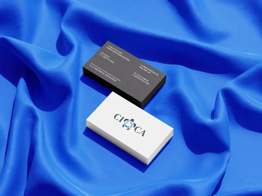
BRAND IN HAND
An identity only matters if it holds up when someone is actually holding it. The stationery, the business cards, the printed collateral, each piece was designed to feel as considered as the institution it represents. The kind of material that gets kept, not discarded.

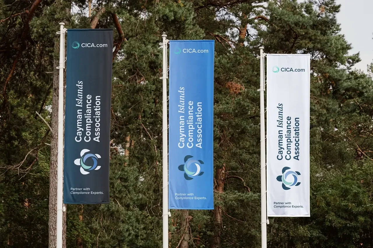
BRAND AS CULTURE
When a brand has genuine roots, it doesn't stay on the page. It moves into the world on the objects people carry, the spaces they work in, the events they attend. The CICA identity was built to live comfortably at that scale, from a conference lanyard to a street-facing billboard, without losing a single degree of authority.

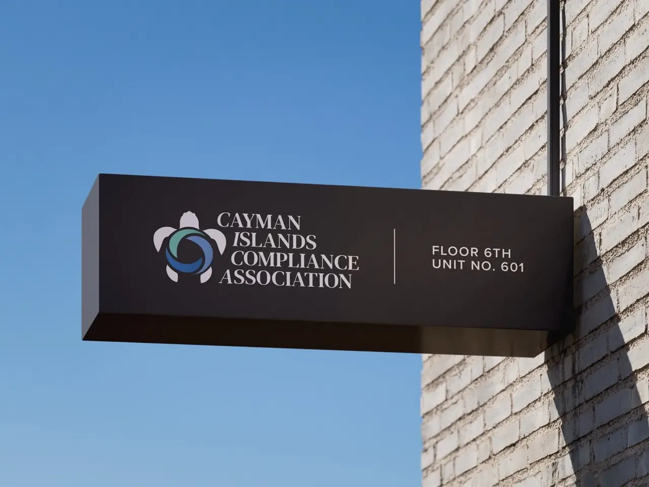
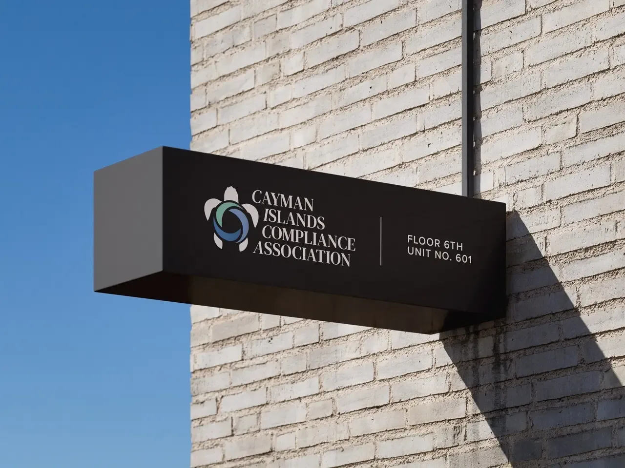
Brand at Scale
From a small plaque to a large-format outdoor placement, the identity was designed from the start to hold its weight at any size. Clear. Confident. Recognizable at a distance and considered up close.


Every brand has a story.